Hidranaven
Back to where it all started: rebranding my family's hydraulics business.De vuelta a donde todo empezó: la nueva marca del negocio hidráulico de mi familia.
Scope: brand design.Alcance: diseño de marca.
Where my design story beganDonde empezó mi historia con el diseño
Hidranaven is my family's business. I grew up going there and spent my summers working alongside my dad.Hidranaven es el negocio de mi familia. Crecí yendo ahí y pasaba los veranos trabajando junto a mi papá.
In college, back in Venezuela, I taught myself Photoshop by editing photos of hydraulic parts for the company. About 15 years ago, I designed its first logo.En la universidad, todavía en Venezuela, aprendí Photoshop editando fotos de piezas hidráulicas para la empresa. Hace unos 15 años, diseñé su primer logo.
Later I left my hometown to build my own path. Years and a whole career later, I came back to the brand with everything I had learned, and gave it the identity it deserved. I don't work there anymore, but this one will always be personal.Más adelante dejé mi ciudad natal para construir mi propio camino. Años y toda una carrera después, volví a la marca con todo lo que había aprendido y le di la identidad que merecía. Ya no trabajo ahí, pero este proyecto siempre será personal.
Trusted, but blending inDe confianza, pero sin destacar
Hidranaven has been a trusted player in the hydraulic market for nearly three decades. To keep standing out in a crowded industry, it needed a fresh look.Hidranaven ha sido un actor de confianza en el mercado hidráulico durante casi tres décadas. Para seguir siendo competitiva en una industria saturada, necesitaba renovar su marca.
Modern, simple, memorableModerna, simple, memorable
Give it a brand that feels modern, warm and professional, and turn a long name into a simple logo that sticks.Construir una marca que se sienta moderna, dinámica, cercana y profesional, y resolver un nombre largo con un logo simplificado que la gente reconozca y recuerde.
Built for recognition and longevityHecha para ser reconocida y perdurar
A fresh identity that feels modern and approachable, made to be recognized today and to last for years.Una nueva identidad moderna, dinámica, cercana y profesional, pensada para ser reconocida y para perdurar.
A simple, distinctive icon builds on the yellow the company has used for years. It keeps everything people already trust about them and makes them easier to spot wherever they show up.Un ícono simple y distintivo se apoya en el amarillo que la empresa ha usado por años. Conserva el valor de marca que se han ganado y los hace más fáciles de reconocer en cada punto de contacto.
To tame the long name, I chose a friendly lowercase typeface that's easy to read and feels welcoming instead of rigid, paired with high contrast colors that stand out next to competitors.El nombre largo se resolvió con tipografía: una fuente en minúsculas que se lee con facilidad y se siente cercana en lugar de rígida, junto a una paleta de alto contraste que destaca en espacios competitivos.
Bold but balanced colors give it an industrial, modern feel while honoring the company's reliability and history. It respects where they come from and is ready for what's next. The refresh was a big success, and today the brand is thriving.Colores audaces pero equilibrados aportan una sensación industrial y moderna, honrando la confiabilidad e historia de la empresa: una identidad contemporánea que respeta su legado y está lista para lo que viene. La renovación fue todo un éxito, y hoy la marca está creciendo.
A simple system, built to lastUn sistema simple, hecho para durar
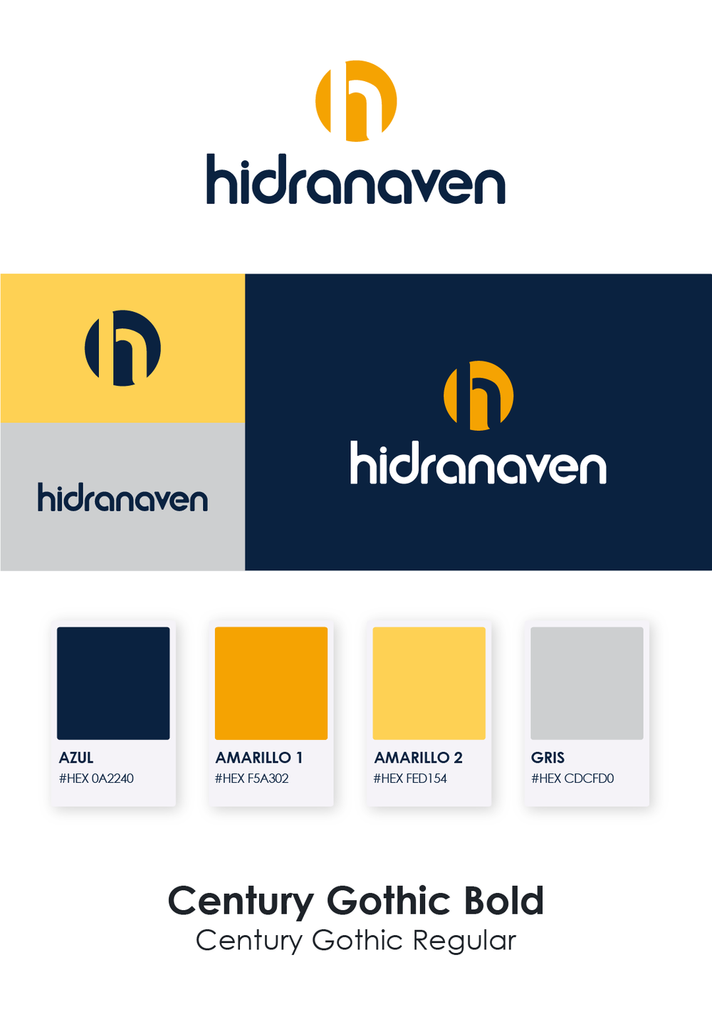
A bold H mark, a friendly custom wordmark and a palette of deep navy and warm yellows. Easy to apply, easy to recognize, from a business card to an Instagram post.Una H con presencia, un logotipo amigable y personalizado, y una paleta de azul profundo y amarillos cálidos. Fácil de aplicar y de reconocer, desde una tarjeta de presentación hasta un post de Instagram.
#0A2240
#F5A302
#FED154
#CDCFD0
Typography: Century Gothic Bold and RegularTipografía: Century Gothic Bold y Regular
The brand out in the worldLa marca en el mundo
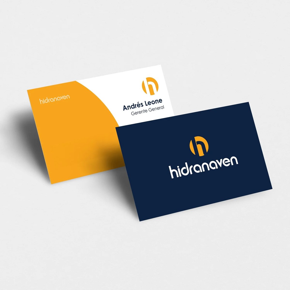
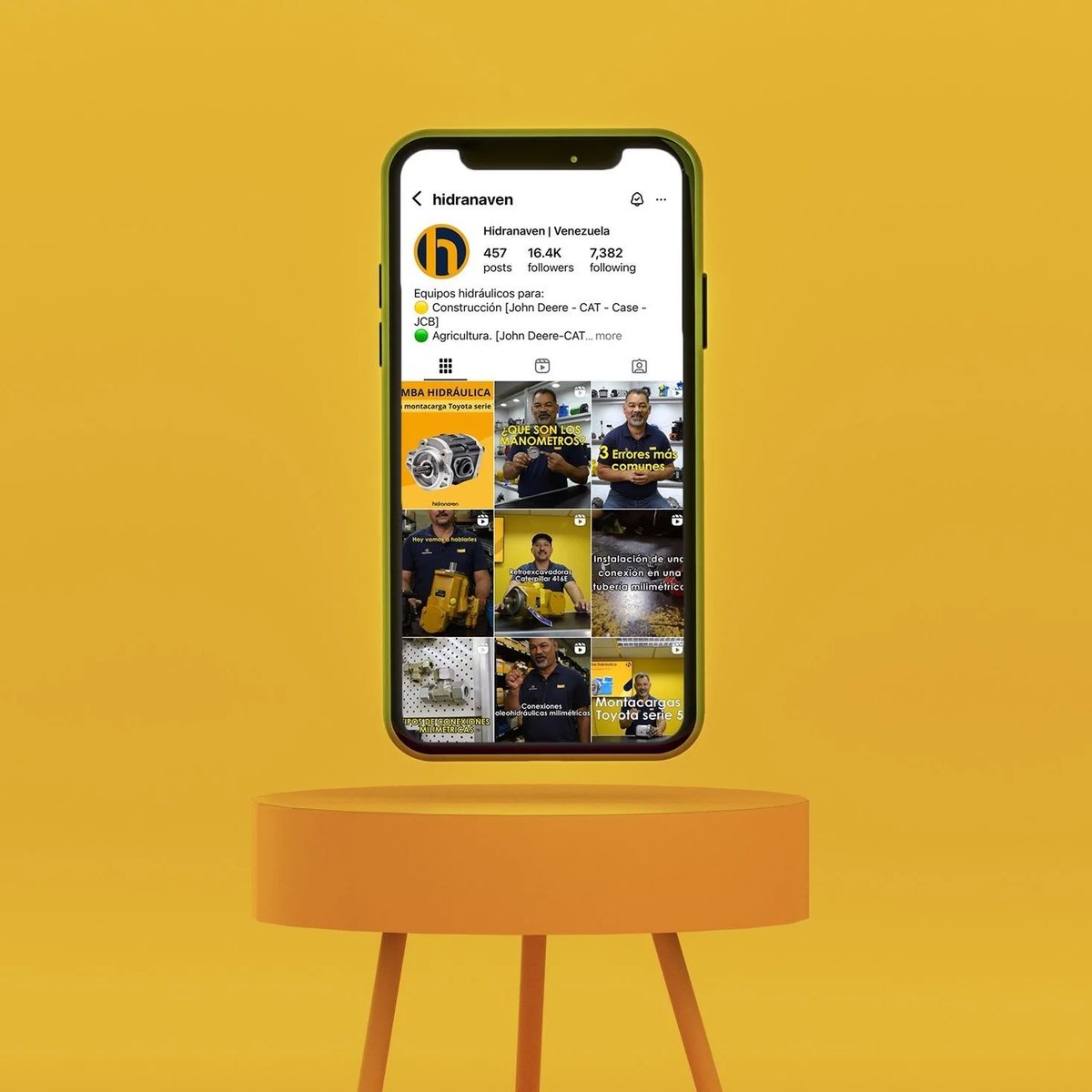
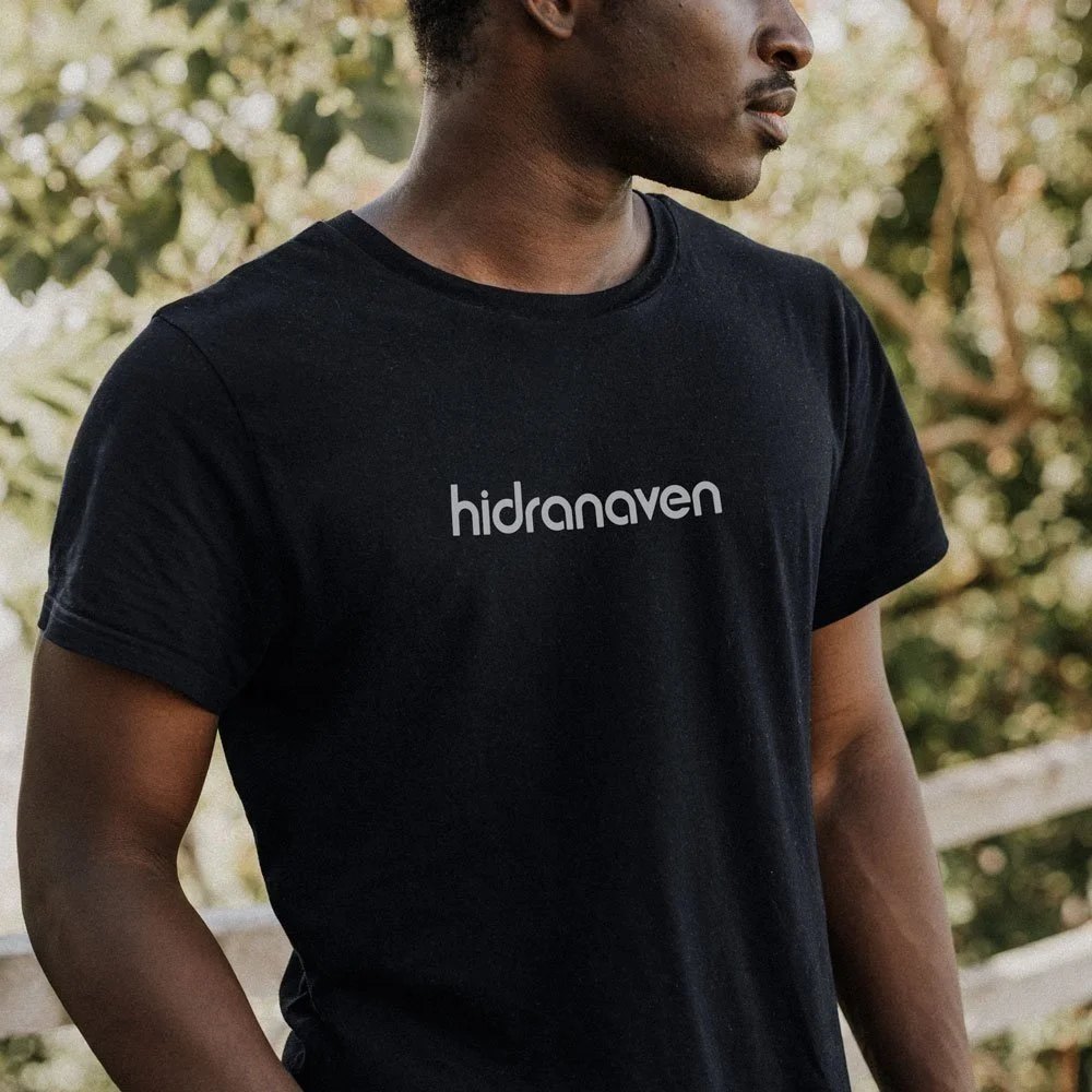
From business cards to social media to team apparel, the new identity works across every touchpoint.Desde las tarjetas de presentación hasta las redes sociales y la ropa del equipo, la nueva identidad funciona en cada punto de contacto.
Other storiesOtras historias

A good refresh keeps what people already love and fixes what's holding you back.Un buen rediseño conserva lo que le da confianza a tu gente y arregla lo que te frena.